
I explored the relationship between different data sets. Using Spreadsheet, D3.js and Adobe Illustrator, I did data analysis and visualised the outcome, which includes both interactive and static graphs. These visualisations can effectively explain complex concepts and deeply engaging viewers.
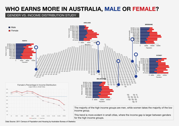
Gender inequality has been a controversial issue for a long time. When given the data set of Australian income distribution, the first question came to my mind is whether each sub-category is equally distributed between men and women.The topic Gender vs. Income Distribution had drawn my attention. I want to explore the gender pattern in income distribution among five large cities. Then I want to know whether this finding is more or is less evident in other areas.
In the stacked bar charts, there are four categories of data -- income distribution, amount of people, gender and major cities. People can see the amount of people and its gender proportion from each single bar, among the bar groups which range from the low-end to the high-end along the income distribution. Five stacked bar charts are placed on the map to represent the five major cities.
In the line graph, I calculated the percentage of women population in each income category, first for the eight capital cities in total and then for the aggregation of other areas. I plot two lines for each of them, and the gap appears quite evident on the graph.
ABS (Australian Bureau of Statistics) Table Builder
Microsoft Excel
RStudio
Adobe Illustrator

This Infographic shows the user research result of University students’ views on Museum Experience.
To produce the word cloud in the center of the poster, I first extracted all the words from Affinity Diagram (User research insights) and order them by frequency. Then I omitted the function words and only used content words to generate the word cloud.
Microsoft Excel
wordclouds.com
Adobe Illustrator
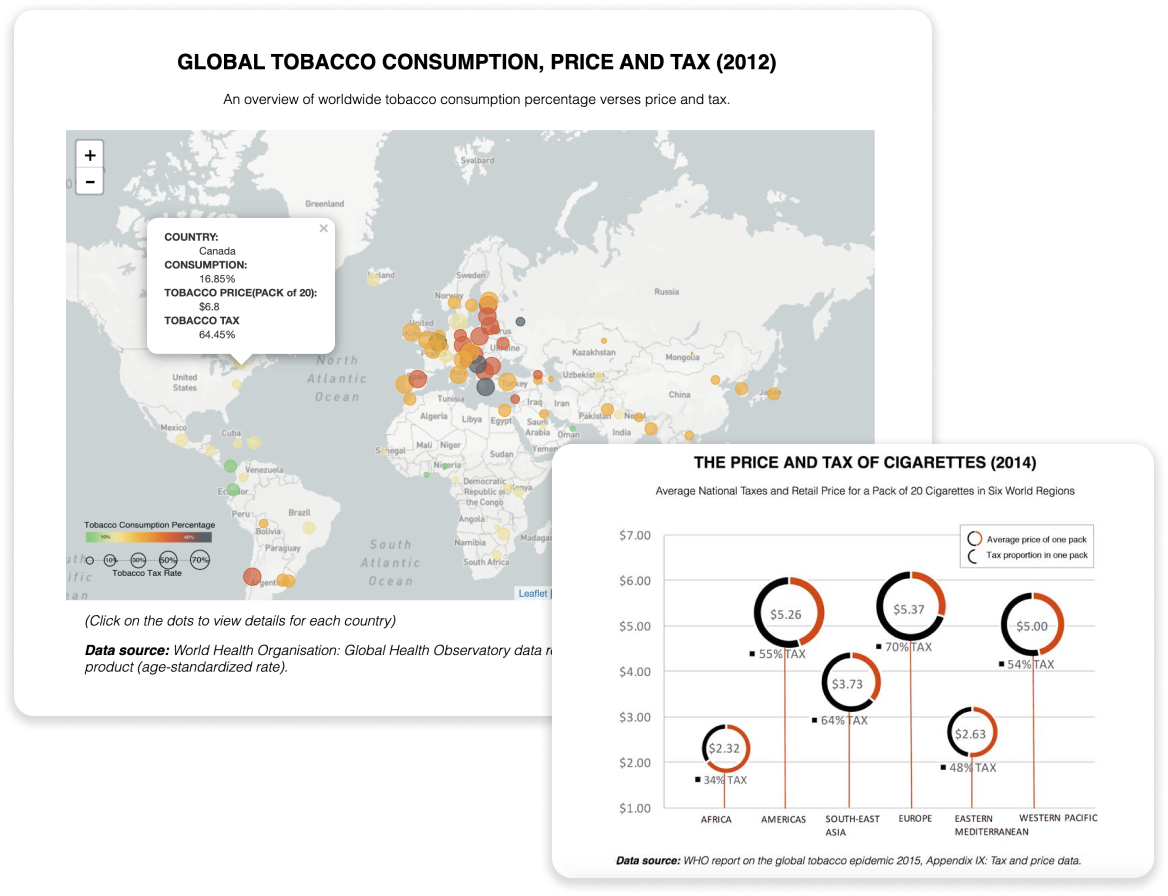
The aim of this inforgraphic is to explore the effectiveness of the tax levy as a tobacco control measure. Specifically, the research maps the overall information on the global smoking rate from 2000 to 2025, compared with the tobacco tax in different country/regions, to reveal the relationship between the tobacco consumption and tax.
This research begins by introducing the prevalence of tobacco consumption over the world, which is supported by a global map of smoking rate. This is an interactive map with information about the trend from 2000 to 2025. Then the tobacco tax in different countries/regions is introduced to give the audience a general view of the tax rate range. With that in mind, people may wonder the effectiveness of tax on tobacco control.
Therefore, a few countries with the highest tax are selected, compared with their smoking rate changes to reveal the correlation. In the end, Australia is taken as an example to show price elasticity of demand for tobacco products and the quit smoking trend.
Microsoft Excel
D3.js
Adobe Illustrator