
A refreshed iOS sign-up journey for Reading Eggs – clearer, brighter, and more user-friendly, designed to boost engagement and improve first-time experience.
Redesigned the iOS onboarding experience – covering UI design, graphics, component system, and developer handoff.
I focused on improving visual clarity, accessibility, and brand consistency, working closely with developers, the PM, and marketing team.
Platforms: iPhone and iPad (Android version coming next)
Deliverables: Welcome screens, sign-up, subscription, login flow, and component system
Process: UI refresh with a scalable design system foundation
Rollout: 50% A/B test for conversion tracking
Jan-Apr 2025
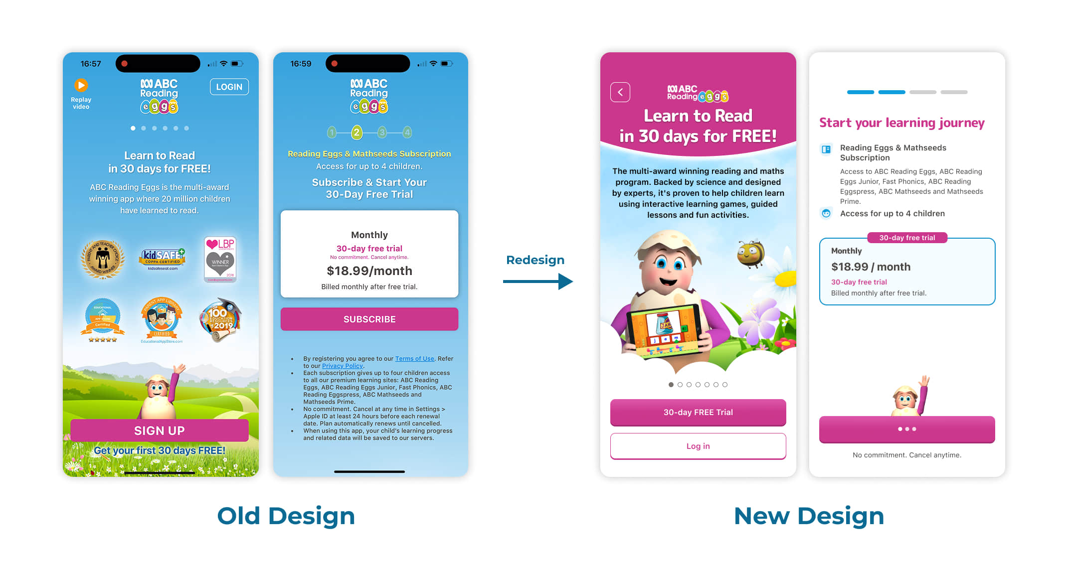
The old design felt dated and overwhelming, especially for first-time users. Key issues:
- Heavy blue colour usage and weak text contrast
- Repetitive content across screens
- Cluttered layout and small fonts
I redesigned the experience with a clearer hierarchy, modern UI, and improved readability.
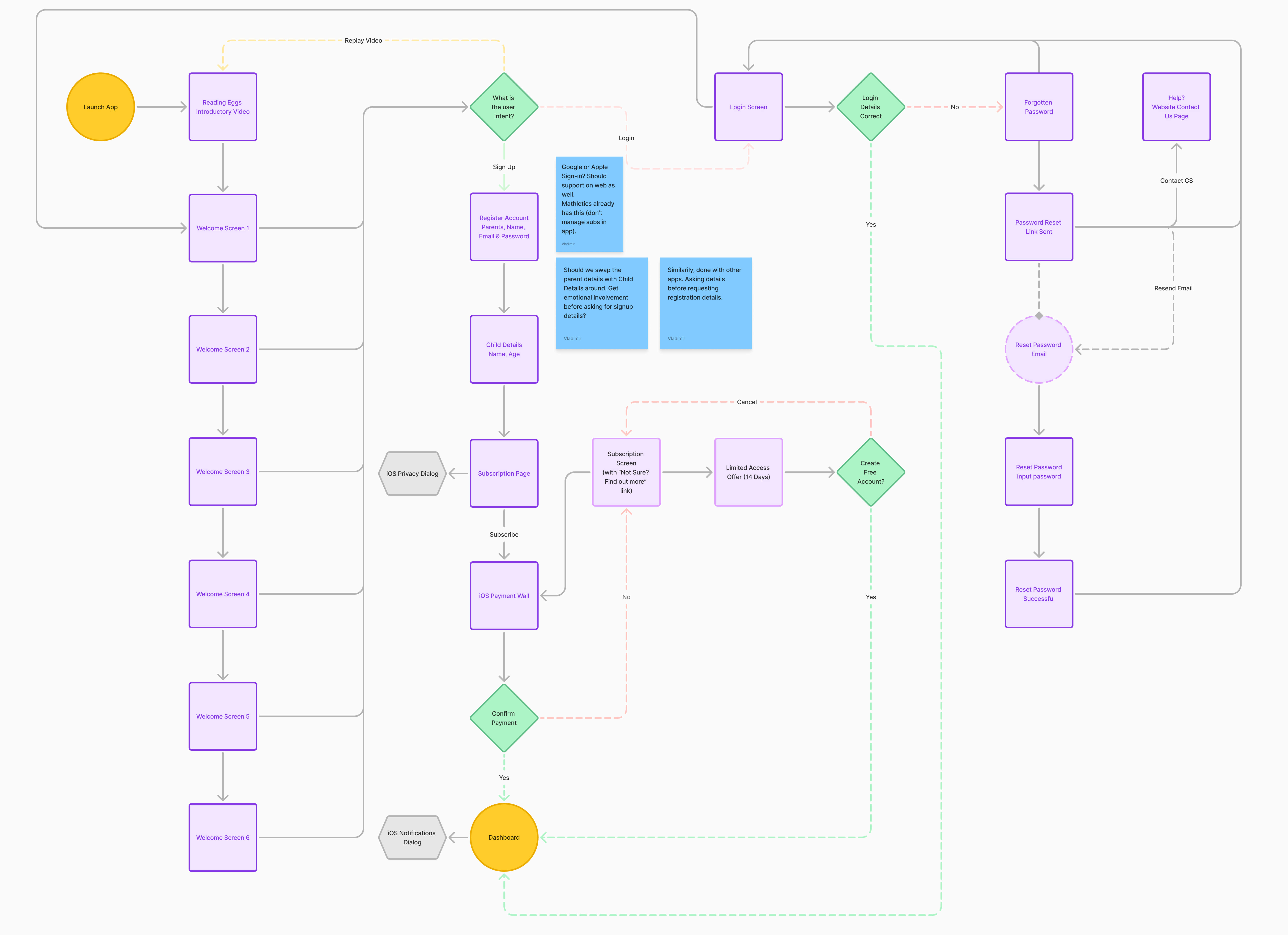
Before starting the visual design, we mapped out the full onboarding journey – including login, sign-up, subscription, and password reset flows.
To help guide the redesign, I reviewed onboarding patterns from other kids and education apps like Duolingo ABC, Reading.com, Lingokids, and Homer. These comparisons highlighted opportunities to improve clarity, spacing, and visual storytelling in our own flow.
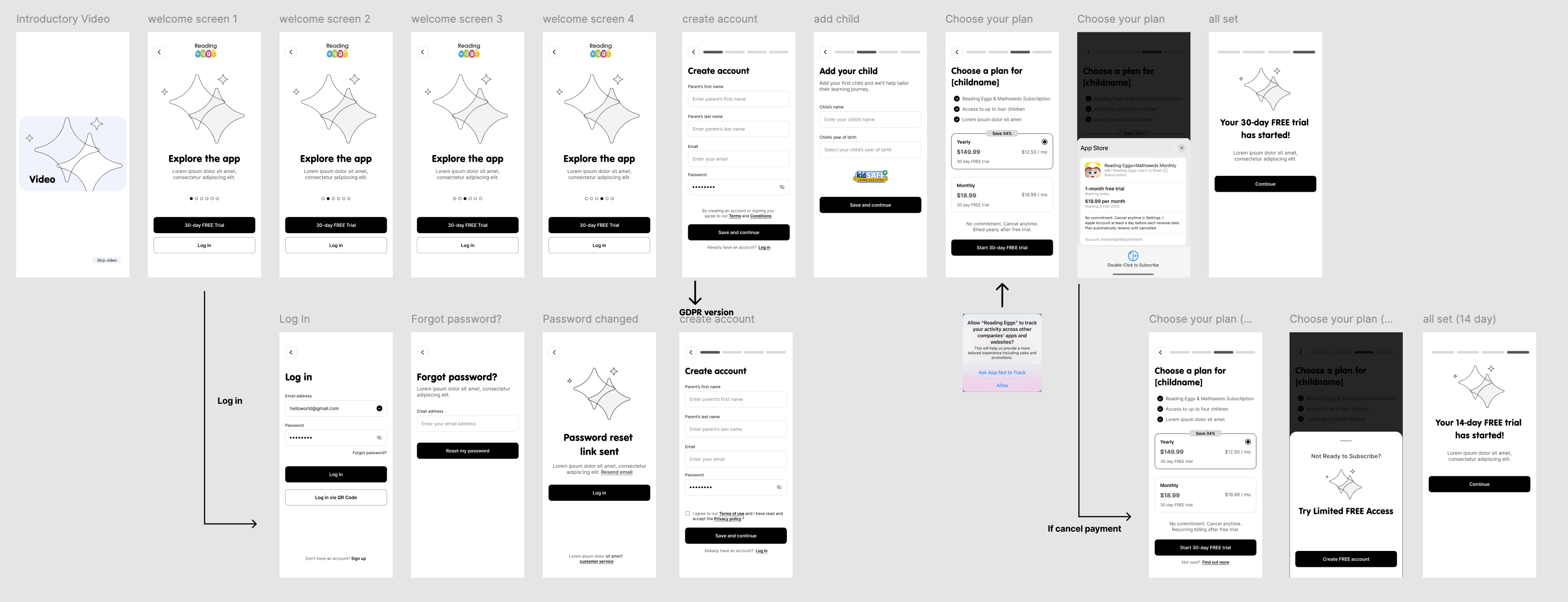
I then created wireframes to explore layout ideas and focus on:
- Visual hierarchy and content grouping
- Button placement and CTA visibility
- Readability and accessibility for parents
This helped lay a strong foundation before moving into high-fidelity design.
The visual redesign focused on bringing warmth, simplicity, and clarity to the entire onboarding experience – without changing the original step structure.
Key changes included:
- Brighter, more consistent UI
- Clear CTAs and less visual clutter
- Better readability with stronger contrast
- A modern component-based layout for scalability
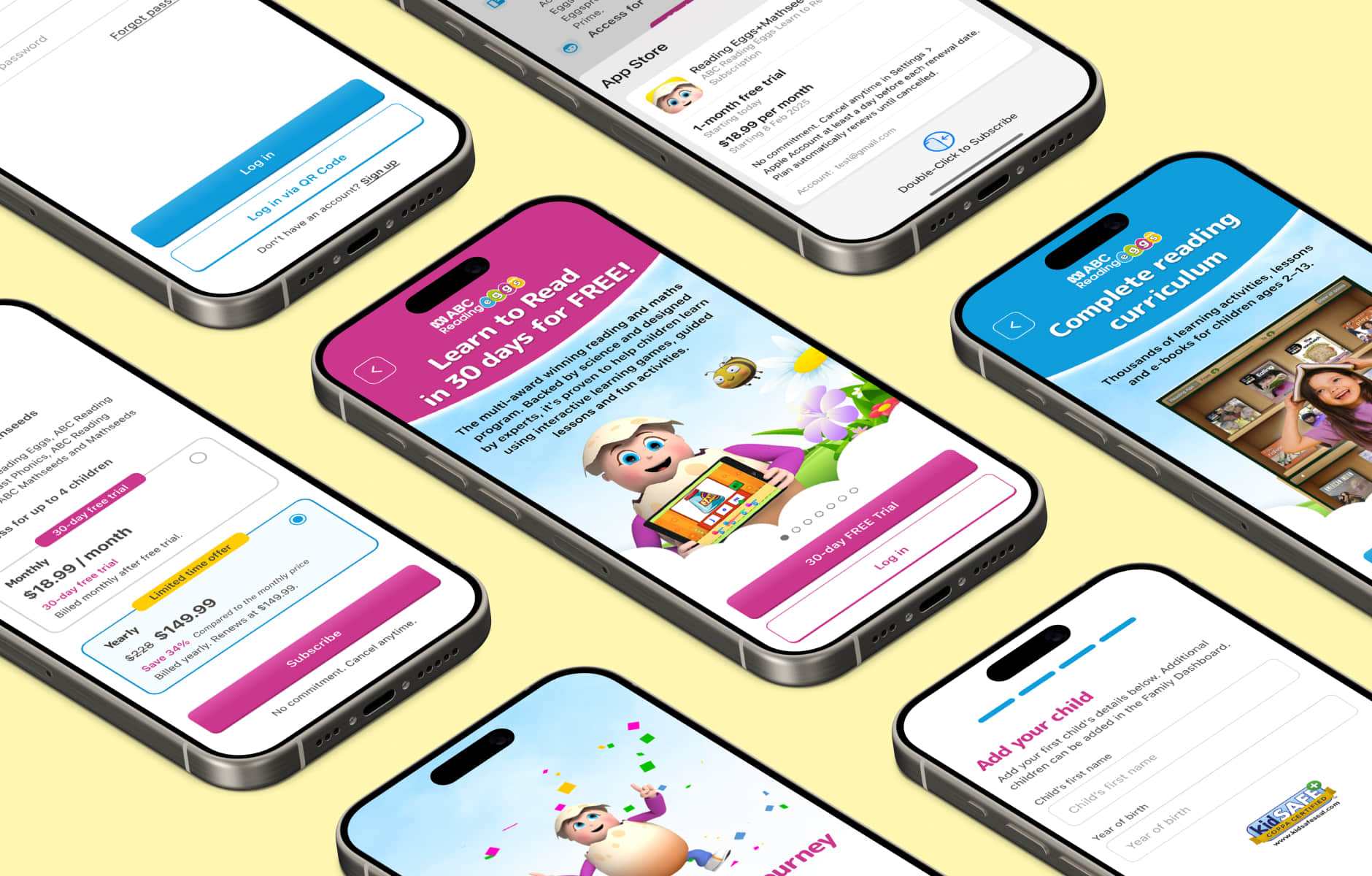
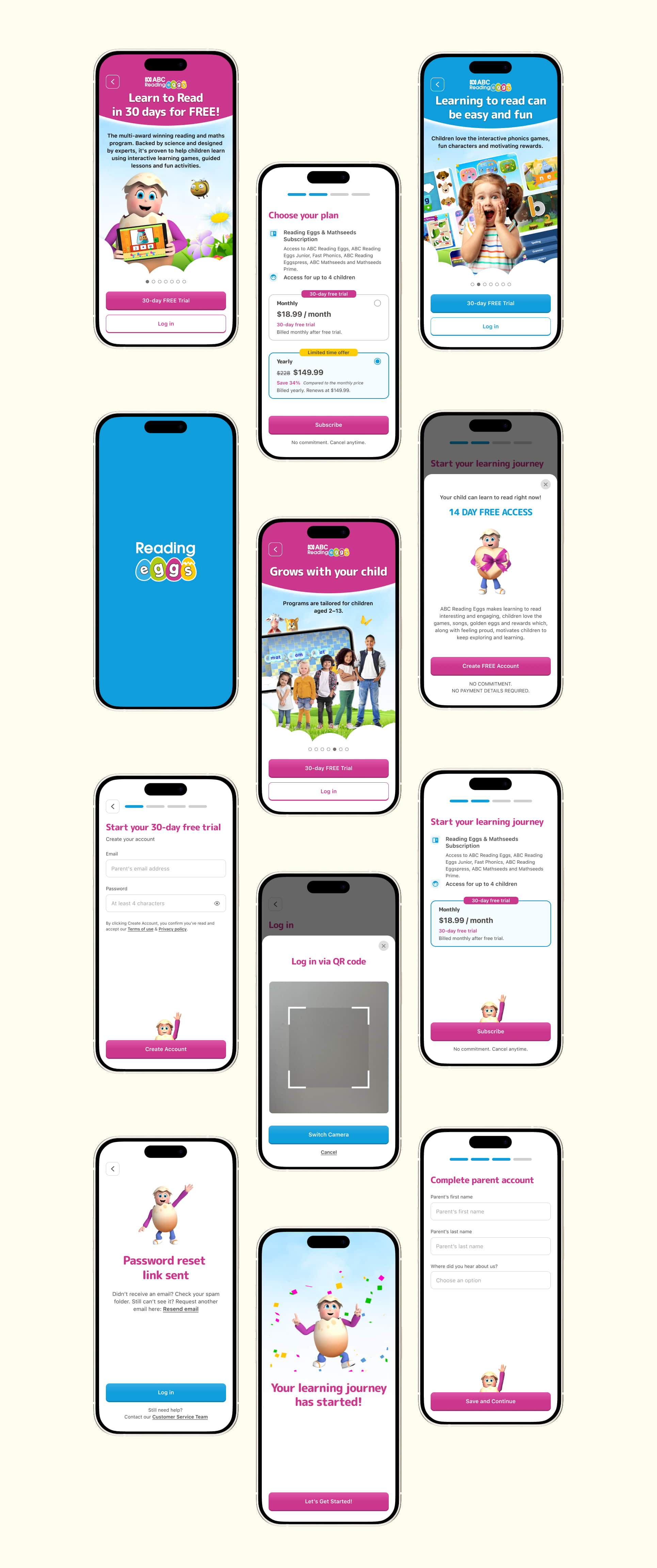
This section includes:
- Welcome screens
- Sign-up and subscription options
- Login & QR flow
- Success and transition into dashboard
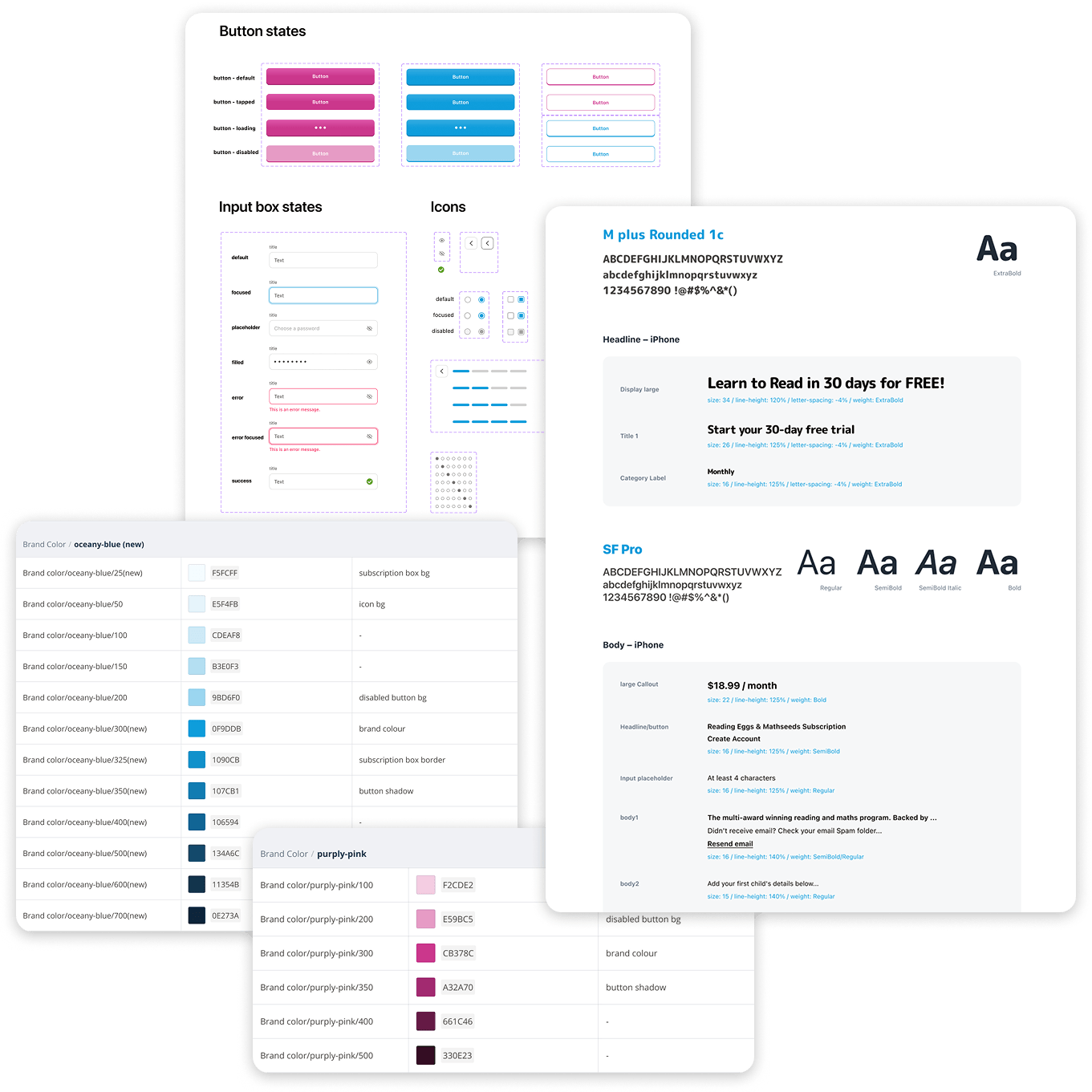
To support development, I built a scalable component system with clearly named layers, spacing rules, and reusable assets.
The handoff included:
- Organized Figma files with consistent naming
- Color + typography tokens
- Responsive components (e.g. inputs, CTA buttons, popups)
- Notes and constraints to support dev logic
The implementation is still in progress. I continue to work with the developer to ensure smooth translation from design to product.
I also helped test the onboarding flow in TestFlight — checking layout accuracy, alignment, transitions, and overall polish to ensure a smooth user experience before rollout.
The new design is currently being developed and will be released as an A/B test to 50% of new iOS users.
We’ll be tracking trial sign-up conversion, drop-off rates, and step completion. Once results are in, we’ll iterate based on insights, and prepare for the Android rollout.